
In the world of Forex trading, charts are more than just lifeless red and green lines. They are the “maps” that guide you, the language of the market, and the most critical tool for a trader to analyze crowd psychology. However, with dozens of different chart types available on platforms like MT4, MT5, or TradingView, the question arises: What is the best chart for Forex trading? Now, let’s take a closer look in the article below.
What is a Forex chart?
A forex chart is a visual tool that tracks the historical price movements of currency pairs, helping traders analyze market behavior. Technical analysts and day traders use these charts to spot patterns like reversals or continuations, guiding entry and exit decisions. Often paired with charting and forecasting software, forex charts, such as line, bar, and candlestick types, are key for projecting short-term price trends and identifying trading opportunities.
See more:
- Mastering candlestick patterns for effective trading
- Top 5 best technical indicators you shouldn’t miss
- Best Popular Types of Reversal Patterns In Trading
- Most Common Continuation Patterns to Capture Market Trends
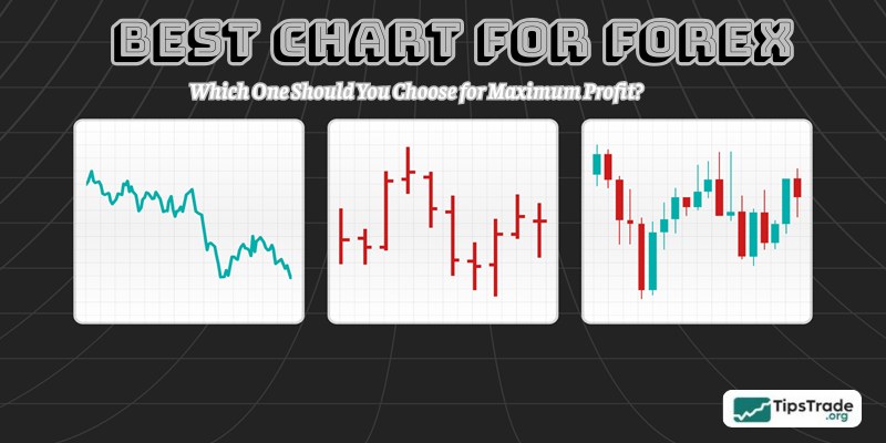
Top 3 the best chart for Forex trading
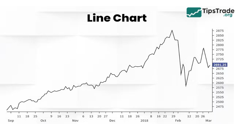
Line charts
The line chart is the simplest form of charting in Forex. It is created by connecting the closing prices of specific timeframes into a continuous line.
- Pros: It eliminates “market noise.” When you don’t need to worry about the high or low prices within a session, the line chart helps you clearly see the market structure (uptrend, downtrend, or sideways) quickly.
- Cons: It lacks critical data. You won’t know how volatile the price was during the session or if long “wicks” were formed, indicating price rejection.
- Best for: Identifying long-term support and resistance levels or spotting major chart patterns like Head and Shoulders.
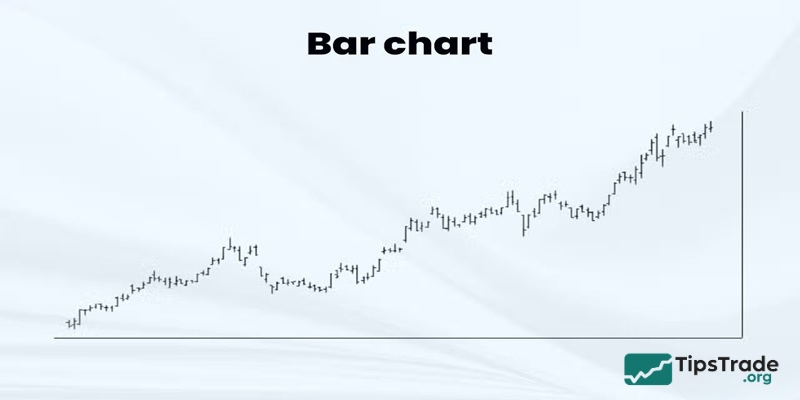
Bar charts (OHLC)
Bar charts provide more information than line charts. Each bar represents a specific time period and displays four key price levels: Open, High, Low, and Close.
- Characteristics: A vertical bar shows the price range from the lowest to the highest. A small horizontal tick on the left is the opening price, and a tick on the right is the closing price.
- Pros: It clearly shows volatility. The longer the distance between the High and Low points, the more volatile the market.
- Cons: It can be visually harder to track compared to candlestick charts, especially when there are many bars on the screen.
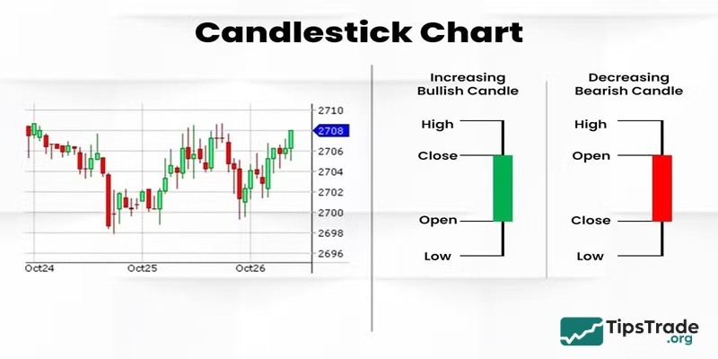
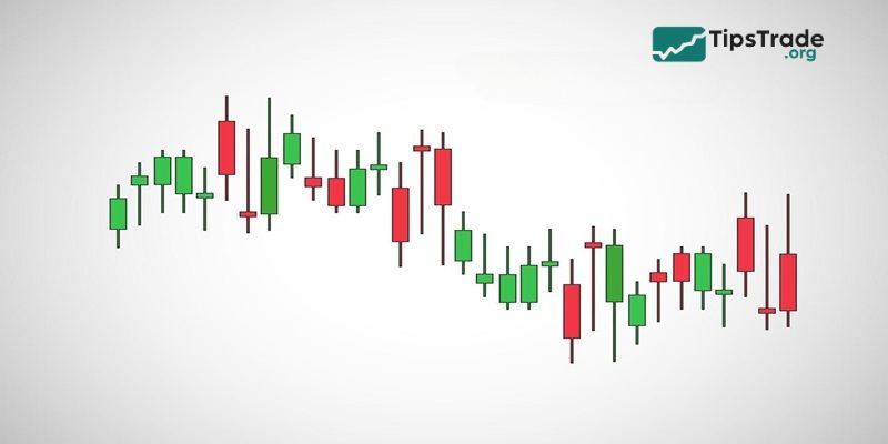
Japanese candlestick charts
If you ask 100 professional traders which chart is the best, 99 will answer: Japanese Candlestick Charts. Developed by Japanese rice traders in the 18th century, this is the most popular technical analysis tool today.
- Why is it the gold standard? Each candle shows not only the OHLC price levels but also features a colorful “body” (usually Green/Red or White/Black). This coloring allows traders to immediately identify whether buyers or sellers are in control.
- Reading psychology: Candlesticks provide incredibly powerful reversal patterns such as Pin Bars, Engulfing patterns, or Dojis. It tells you whether the market is hesitating or exploding at a single glance.
Advanced Forex charts for professional traders
Beyond the three basics, veteran traders often turn to custom chart types to filter signals more effectively.
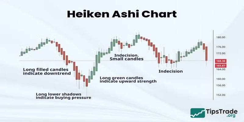
Heikin-Ashi
Heikin-Ashi translates to “average bar” in Japanese. Instead of using raw open/close prices, it uses an average calculation formula to create smoother candles.
- Benefits: In a strong uptrend, Heikin-Ashi will display a continuous string of green candles without being interrupted by small red candles. This helps traders avoid panic and “ride the trend” much longer.
- Limitations: It does not reflect the exact current market price at a specific moment, making it less ideal for precision entries (timing the exact pip).
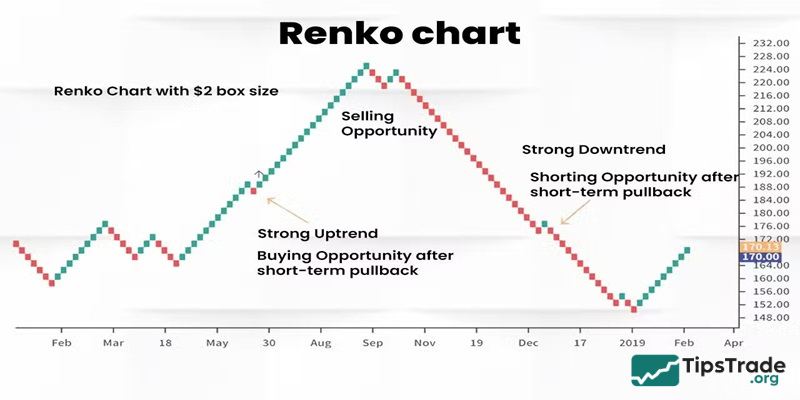
Renko charts
Renko charts (from the Japanese word “renga,” meaning brick) are unique because they are independent of time. A new brick is only created when the price moves a specific distance (e.g., 10 pips).
Why use it? If the price moves sideways (consolidation), the Renko chart stays still. This is extremely useful for filtering out noisy accumulation phases, allowing you to focus only on significant price movements.
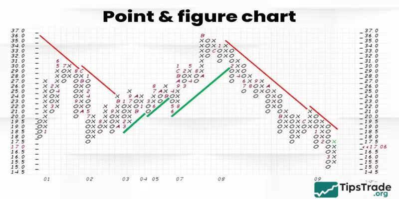
Point and Figure (P&F) charts
This is a classic chart type using columns of “X” (rising prices) and “O” (falling prices). Similar to Renko, it ignores the time factor and focuses solely on price reversals. It is an excellent tool for identifying breakouts and long-term price targets.
How to choose the best chart for Forex trading
There is no “one-size-fits-all” chart for every situation. Selecting the best chart for Forex trading depends on various factors, including your trading style and the level of detail you need. Factors to consider:
- Trading style: Day traders might prefer bar or candlestick charts for their detailed price information, while long-term traders might find line charts more useful for identifying overall trends.
- Level of detail: If you need detailed price data, bar and candlestick charts are ideal. For a simpler overview, line charts may suffice.
- Market conditions: In volatile markets, Heikin Ashi and Renko charts can help to filter out noise and highlight the main trend.
Choosing the right chart type is crucial for effective technical analysis. Different chart types offer unique perspectives on price data, and selecting the one that best suits your trading style and analytical needs can significantly enhance your trading performance.
Essential tips to optimize your Forex charts
Choosing a chart is just the first step. You must know how to set them up:
- Smart color schemes: Avoid using overly bright colors like neon red or electric green on a pitch-black background for long periods, as this causes eye strain. Try softer tones like forest green/white or slate gray/blue.
- “Less is more” principle: Do not clutter your charts with too many indicators. A Clean Chart with 1-2 supporting indicators (like an MA or RSI) will help you make clearer decisions.
- Timeframe correlation: Always check at least two timeframes. For example: View the trend on H4 using a Line Chart and find your entry on H1 using Candlesticks.
Conclusion
Searching for the “Best chart for Forex” is actually a journey to find the best fit for you. For the vast majority of traders, Japanese Candlesticks remain the optimal choice due to their comprehensive data and visual clarity. However, don’t hesitate to experiment with Heikin-Ashi if you struggle with holding trades, or Renko if you want to eliminate market noise. Remember that: The chart is just a tool. Risk management and psychological discipline are what ultimately determine your sustainable profit in the Forex market. Wishing all Forex traders great success!!!