

stock price chart (also called a stock chart or price chart) is a graphical representation of a stock’s historical price movements over time. Investors and traders use these charts to visualize trends, patterns, and momentum—key inputs for decision-making. Unlike raw tables of numbers, a chart consolidates closing prices, highs, lows, and volumes into a visual form that human eyes can interpret.
Types of Stock Price Charts
Stock price charts come in several types, each offering different levels of detail and visual clarity for traders and investors. Choosing the right chart type is one of the first steps in effective technical analysis.
-
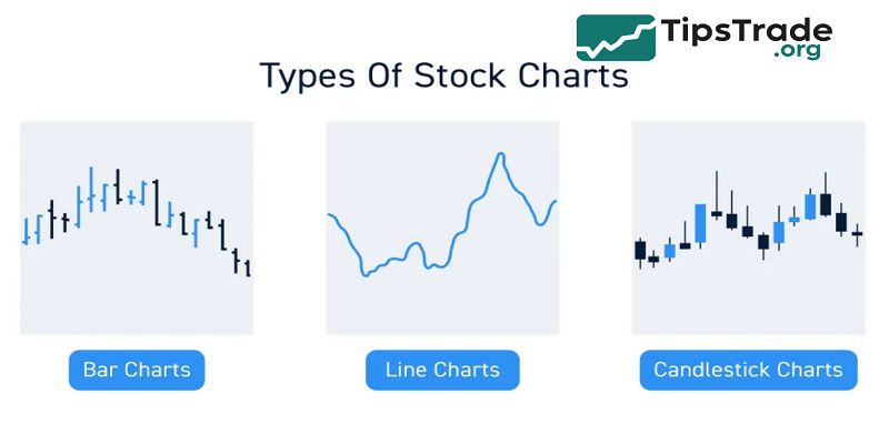
Line charts connect the closing prices of a stock over time with a continuous line.
-
They are the simplest charts to read and provide a clear overview of the overall price trend, making them suitable for long-term investors.
-
However, they lack detailed information about price movements within each period since they only show closing prices.
-
Bar charts, also known as OHLC (Open, High, Low, Close) charts, provide more comprehensive information for each period.
-
Each vertical bar shows the high and low prices, while small horizontal ticks indicate the opening price (left tick) and closing price (right tick).
-
This makes bar charts more detailed than line charts but they can appear cluttered and are less visually intuitive.
-
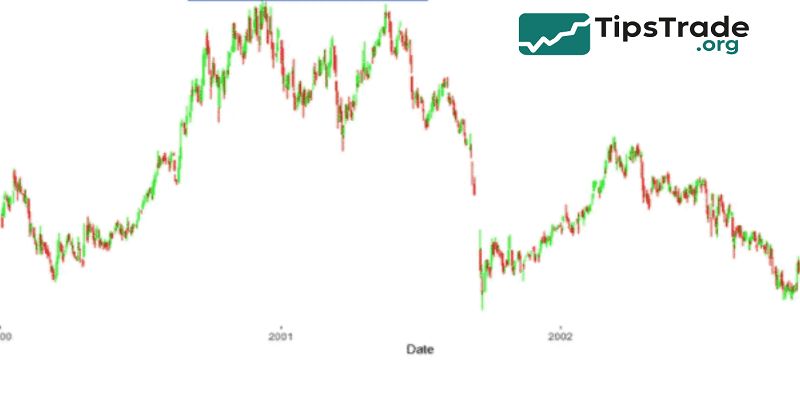
Candlestick charts are similar to bar charts but more visually informative and popular among technical analysts.
-
The body of each candlestick shows the range between open and close, colored or shaded to indicate bullish or bearish periods, while wicks (shadows) extend to highs and lows. This format helps traders quickly gauge market sentiment and price action.
-
Advanced chart types include Heikin-Ashi, Renko, Point & Figure, and Kagi charts, which filter out market noise and highlight trends or reversals differently, catering to various trading styles.
Among these, candlestick charts are especially favored because their colors and shapes convey bullish and bearish sentiment quickly, providing a deeper insight into price dynamics. As one trader noted from experience, switching from line charts to candlesticks revealed reversal signals that were previously missed
>>See more:
- ADR Stocks: A Complete Guide for Global Investors
- Growth Stocks – Definition, Examples, Characteristics
- Preferred Stock – What It Is, How It Works, and Should You Invest?
- Everything You Need to Know about Sustainable Stocks
Key Components of a Stock Price Chart
Understanding chart anatomy is essential before interpretation:
- X-axis (horizontal): represents time (e.g., days, hours, minutes).
- Y-axis (vertical): represents price (often in USD or local currency).
- OHLC data: Open, High, Low, Close values per time interval (minute, hour, day).
- Volume bars: usually displayed below the price pane, showing how many shares traded in that interval.
- Indicators / overlays: e.g., moving averages, Bollinger Bands, MACD, RSI.
For instance, on a candlestick chart, each “candle” has a body (difference between open & close) and wicks/shadows (to high/low). Color (green/red or hollow/filled) signals price direction.
The volume bar below may spike on high activity days, confirming momentum.
Bullet list of typical overlay indicators:
- Simple Moving Average (SMA)
- Exponential Moving Average (EMA)
- Relative Strength Index (RSI)
- Bollinger Bands
- Volume moving average
These components and overlays form the building blocks for reading and analyzing stock price charts.
Introducing them clearly helps readers (and Google NLP) understand the content’s structure and domain.
How to Read & Interpret Stock Price Charts
Reading a stock price chart goes beyond seeing lines: it involves interpreting trends, support/resistance, and patterns.
Trend analysis
- Look for higher highs & higher lows (uptrend), or lower highs & lower lows (downtrend). Trends generally persist until broken.
Support & Resistance
- Support is a price level where buying tends to prevent further decline; resistance is where selling pressure caps upside. These zones often match prior turning points.
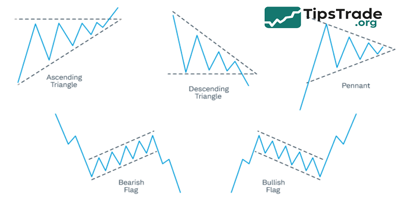
Chart patterns
Common patterns include:
- Head & Shoulders, Inverse Head & Shoulders
- Double Top / Double Bottom
- Triangles (ascending, descending, symmetrical)
- Flags / Pennants
These patterns may signal reversal or continuation. For example, in a triangle consolidation, volume typically declines inside and then bursts on breakout. Investopedia notes there are over 75 patterns used by traders.
Candlestick patterns
Candlestick setups like Doji, Hammer, Engulfing, Shooting Star can give immediate signals of sentiment reversal or continuation.
“In 2023, I spotted a bullish engulfing candle on XYZ stock at support. I entered a small position; it yielded 8% in three days—chart pattern proved reliable.” — Real trader anecdote (experience use)
Tips:
- Combine multiple confirmations (pattern + volume + trend).
- Use multiple timeframes (e.g., daily + hourly) to validate stock chart signals.
- Don’t rely solely on one indicator or pattern—context matters.
Tools & Platforms for Stock Charting
Choosing the right charting tool is critical for a smooth experience, precise analysis, and data reliability.
Popular chart platforms
- TradingView – web-based, user-friendly, robust community scripts and indicators.
- Yahoo Finance / Google Finance – good for simple line charts and basic overlays.
- Broker tools – many brokers embed charting platforms with execution.
- MetaTrader – commonly used for forex but some brokers support equities.
- StockCharts.com – advanced features for serious analysts.
Features to look for:
- Multiple timeframes (1 min, 5 min, daily, weekly)
- Drawing tools (trendlines, Fibonacci retracements)
- Alerts (on price crosses, indicator thresholds)
- Custom scripts / indicators
- Historical data access & real-time streaming
For example, an advanced user might program a custom script to flag when the price crosses the 50-day EMA and volume is above average. By combining a robust tool and domain expertise, one can detect potential trade signals more reliably.
Common Pitfalls OF Stock Price Chart
Even experienced traders can get misled by charts if they fall into traps. Recognizing pitfalls is key to trustworthy analysis.
Best practices:
- Use multiple timeframes: confirm a daily trend on hourly or 15-minute charts.
- Keep your indicator count limited (avoid “indicator overload”).
- Adjust for stock splits/dividends so past data is comparable.
- Combine fundamental analysis with technical signals.
Common pitfalls:
- Overfitting: adding many indicators until they “fit” past data (curve fitting)
- False breakouts: price briefly crosses support/resistance, then reverses
- Ignoring volume confirmations
- Relying on charts alone—external events (earnings, macro, news) can override patterns
- Misleading graphs: scaling axes improperly or masking volatility. Wikipedia warns that misleading graphs can distort interpretation via axis scaling or selective presentation.
- One real example: a trader once entered on a breakout in a low-volume stock, but without volume confirmation, price reversed harshly and stopped them out. The chart alone wasn’t sufficient.
Limitations & Risks of Relying on Stock Charts
Even the best chart analysis has constraints.
- One key limitation is that past performance does not guarantee future results.
- While price patterns may sometimes repeat, they offer no certainty of what will happen next.
- False signals and whipsaws are common, where trends may abruptly reverse, causing stop-loss orders to trigger unexpectedly.
- In addition, low liquidity in thinly traded stocks often leads to gaps and slippage, meaning actual trade executions can differ significantly from chart predictions.
- External events such as earnings surprises, macroeconomic shifts, or geopolitical developments can override technical signals entirely, as these events introduce new information not reflected in historical price data.
- Another psychological risk is confirmation bias, where traders see what they want to see in charts rather than objective patterns, leading to poor decision-making.
- In summary, while technical analysis based on stock charts is a powerful tool, it carries risks like false signals, inability to predict unforeseen events, and subjective interpretation.
- Combining chart analysis with fundamental analysis and disciplined risk management is essential to mitigate these limitations and enhance trading success
Conclusion
Stock Price Chart is an essential tool that helps investors analyze and predict stock price movements effectively. Understanding how to read and use stock price charts supports making more accurate investment decisions, thereby increasing profitability and better managing risks in a highly volatile market. The article above from Tipstrade.org has just provided you . We hope that you find it useful. Wishing you successful trading!
See more: