
Stock charts play a crucial role in the world of investing and trading by providing a visual representation of a stock’s price movements over a specific period. They allow investors to analyze historical trends, identify patterns, and make informed predictions about future price behavior. Stock charts come in various types, such as line charts, bar charts, and candlestick charts, each offering unique insights into market dynamics. By studying these charts, traders can spot key signals related to market momentum, support and resistance levels, and potential reversal points. Overall, stock charts serve as indispensable tools for anyone looking to understand market conditions and make strategic financial decisions.
What Are Stock Charts?
- A stock chart is a graphical representation of a stock’s price movement over a specific period. It displays data such as opening price, closing price, highest price, and lowest price, typically plotted along a time axis.
- These visualizations allow investors to assess market performance, trends, and potential reversals.
- In simple terms, stock charts convert raw numerical data into visual insights.
- Instead of manually comparing daily prices, traders can quickly see where a stock has been and where it might go next.
- For example, when analyzing Apple’s (AAPL) price over six months, a chart will show upward or downward momentum—helping investors determine entry or exit points.
- Professional traders rely on charting tools from platforms like TradingView, MarketWatch, or Yahoo Finance because charts are not only visually informative but also customizable.
- You can change time frames (daily, weekly, monthly), overlay indicators, and compare multiple securities to gain perspective.
What is stock liquidity?
>>Read more:
- Stock Issuance: A Detailed A-to-Z Guide for Investors
- What are stock exchanges and how do they work?
- Understanding Dividend stocks and how to invest in them
- What Is Stock Valuation? Notes When Valuation Of Stocks
Types of Stock Charts
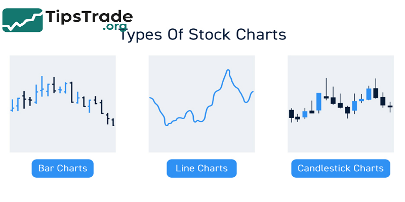
There are several types of stock charts, each offering unique advantages. Choosing the right one depends on your trading style and analytical needs.
Line Charts
- Line charts are the simplest form of stock chart. They connect closing prices over a given period, forming a single continuous line.
- Although line charts lack detailed intraday data, they are ideal for beginners who want to understand overall trends.
- For instance, a line chart of the S&P 500 over five years shows broad market direction and long-term cycles without overwhelming the viewer with too much information.
Advantages:
- Easy to read and interpret
- Great for identifying general trends
- Useful for long-term investors
Limitations:
- Does not display intraday fluctuations
- Lacks volume data and price detail
Bar Charts
- Bar charts provide more detailed information than line charts.
- Each bar represents the stock’s open, high, low, and close (OHLC) prices for a specific period.
- This structure helps investors see volatility and price ranges at a glance.
- Bar charts are especially popular among technical analysts who study price patterns to predict future movements.
- A tall bar indicates high volatility, while a short bar suggests stability.
Example: In a volatile tech stock like Tesla (TSLA), wide bar lengths often signal increased trader activity before earnings announcements.
Candlestick Charts
Candlestick charts, originating from 18th-century Japanese rice traders, are now the most widely used chart type among traders. Each “candle” shows the open, high, low, and close prices for a given time frame—but adds a visual component:
- A green (or white) candle indicates a price increase (bullish).
- A red (or black) candle represents a price decrease (bearish).
Candlestick patterns—such as Doji, Hammer, and Engulfing—offer clues about market sentiment. Experienced traders use these formations to anticipate reversals or continuation signals.
Expert Tip: Studies from Chartered Market Technician (CMT) courses show that combining candlestick patterns with trend indicators like moving averages enhances accuracy in predicting short-term price action.
Key Elements of Stock Charts
To analyze stock charts effectively, investors must understand their key components:
| Element | Description | Purpose |
|---|---|---|
| Price Axis (Y-axis) | Represents stock prices | Tracks price movements over time |
| Time Axis (X-axis) | Represents time periods | Shows trends and cycles |
| Volume Bars | Show the number of shares traded | Measures market participation |
| Indicators | Mathematical tools applied to price | Identify trends, momentum, and volatility |
| Support & Resistance Lines | Price levels where demand or supply dominate | Predict breakout or reversal zones |
By mastering these basics, traders can interpret data beyond surface trends—understanding why prices move, not just how they move.
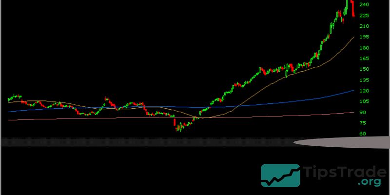
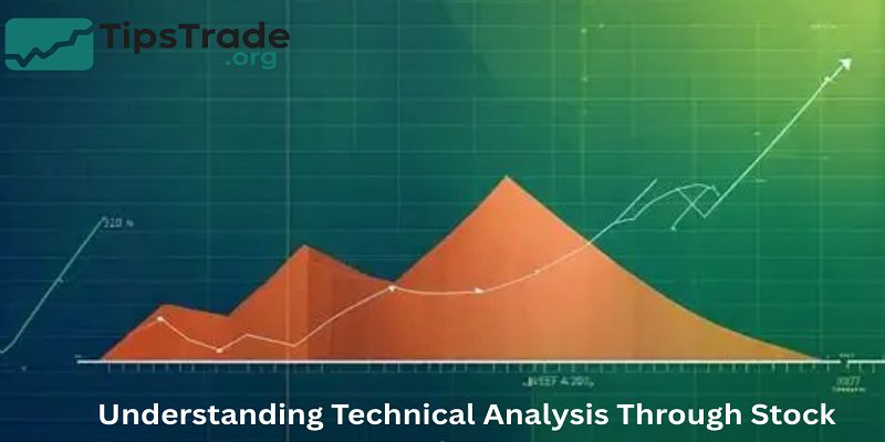
Understanding Technical Analysis Through Stock Charts
Technical analysis is the study of price action to forecast future movements based on historical data. Stock charts form the foundation of this analysis. Analysts believe that all known information—earnings, sentiment, macroeconomic data—is already reflected in the stock price.
The Principle of Trends
According to Dow Theory, prices move in trends: uptrends, downtrends, or sideways movements. Recognizing these early helps traders align with the dominant market force.
- Uptrend: Higher highs and higher lows → bullish momentum
- Downtrend: Lower highs and lower lows → bearish momentum
- Sideways: Consolidation phase before a potential breakout
For example, when the NASDAQ Composite Index consistently forms higher highs over several months, it signals strong investor optimism in growth stocks.
Volume Analysis
- Volume confirms price action. A rise in volume during an uptrend validates buying pressure, while declining volume suggests weakening momentum. Conversely, high volume during a price decline may indicate panic selling or institutional activity.
Example: When Apple’s stock breaks through a key resistance level with record trading volume, analysts interpret this as confirmation of a breakout supported by market conviction.
Popular Technical Indicators Used in Stock Charts
Technical indicators transform raw price and volume data into actionable insights. Here are the most used tools by professional traders:
Moving Averages (MA & EMA)
Moving averages smooth price data to reveal the underlying trend.
- Simple Moving Average (SMA): Average of closing prices over a period (e.g., 50-day SMA).
- Exponential Moving Average (EMA): Gives more weight to recent prices, responding faster to changes.
Use Case: Many traders use the Golden Cross (50-day MA crossing above the 200-day MA) as a bullish signal and the Death Cross as a bearish indicator.
Relative Strength Index (RSI)
The RSI measures momentum by comparing recent gains to losses. It ranges from 0 to 100:
- RSI > 70 → Overbought (potential price correction)
- RSI < 30 → Oversold (potential rebound)
This tool helps identify entry and exit points based on momentum exhaustion.
Moving Average Convergence Divergence (MACD)
- MACD tracks the relationship between two EMAs (typically 12-day and 26-day).
- When the MACD line crosses above the signal line, it suggests bullish momentum. A cross below implies bearish sentiment.
- Professional analysts often use MACD to confirm trends observed in RSI or price patterns
Bollinger Bands
- Created by John Bollinger, these bands measure volatility around a moving average.
- When prices move closer to the upper band, the asset may be overbought; when they near the lower band, it could be oversold.
Example: During periods of high volatility (e.g., post-earnings), Bollinger Bands widen, signaling potential breakouts.
How to Read Stock Charts Like a Professional

Reading stock charts effectively requires structured observation. Here’s a step-by-step approach:
- Identify the time frame – Daily charts for short-term trades, weekly/monthly for long-term investing.
- Observe trend direction – Determine if prices are making higher highs or lower lows.
- Analyze support and resistance – Mark key price levels where reversals occurred.
- Check volume behavior – Confirm whether volume supports price movement.
- Apply technical indicators – Use RSI, MACD, or moving averages for confirmation.
- Interpret candlestick patterns – Spot reversal signs like Doji or Morning Star.
Example: A professional might notice a “double bottom” pattern forming with rising volume—indicating strong buying pressure and potential trend reversal.
Common Mistakes When Using Stock Charts
Even experienced investors make mistakes when analyzing charts. Recognizing them early prevents costly decisions.
- Overloading with indicators: Using too many tools can create confusion rather than clarity.
- Ignoring broader context: Charts show price, not fundamentals. Combine both for better accuracy.
- Chasing short-term patterns: Not every pattern leads to a breakout; patience and confirmation matter.
- Emotional bias: Overconfidence or fear often leads to misinterpretation of signals.
Tip: Use a trading journal to document chart observations and decisions—helping refine your analysis over time.
Real-World Example – Applying Stock Chart Analysis
Let’s consider a practical case study using Microsoft (MSFT) stock:
- Step 1: Identify a six-month chart timeframe.
- Step 2: Notice a consistent uptrend with occasional pullbacks.
- Step 3: Apply a 50-day and 200-day moving average. The 50-day stays above the 200-day (bullish).
- Step 4: RSI remains between 40–70, showing steady momentum.
- Step 5: Volume spikes align with earnings announcements—confirming institutional buying.
Result: The technical outlook supports a “buy on dips” strategy, backed by strong volume and trend confirmation.
Choosing the Right Stock Charting Platform
Reliable data and visualization tools are essential for effective analysis.
Here are some of the most trusted charting platforms:
| Platform | Features | Best For |
|---|---|---|
| TradingView | Advanced indicators, social community, real-time data | Active traders & analysts |
| StockCharts.com | Clean charts, education resources | Beginners & long-term investors |
| MarketWatch | Financial news + charts integration | News-driven investors |
| Yahoo Finance | Free charts, company fundamentals | Casual investors |
| ThinkorSwim (TD Ameritrade) | Professional-grade analysis tools | Advanced traders |
When choosing a charting tool, prioritize data accuracy, customization options, and user-friendly interface
Combining Technical and Fundamental Analysis
While technical analysis focuses on price behavior, fundamental analysis examines a company’s intrinsic value through financial statements.
The best investors use both:
- Technical analysis helps with timing.
- Fundamental analysis helps with selection.
For instance, you might use technical charts to find the best entry point for a fundamentally strong company like Apple or Microsoft.
Stock Charts for Beginners vs Professionals

For Beginners:
- Focus on line and candlestick charts.
- Learn one or two indicators (e.g., RSI and MA).
- Avoid overtrading based on short-term moves.
For Professionals:
- Use multiple time frames (daily, weekly, monthly).
- Combine indicators and pattern recognition.
- Apply quantitative models for precision trading.
Experience Insight: According to CFA Institute, professional traders spend up to 70% of their analysis time studying price action before making decisions.
Conclusion
Stock charts is the foundation of smart market analysis. By learning how to read chart types, recognize patterns, and interpret indicators, investors can make more confident, evidence-based investment decisions. Whether you’re a beginner tracking price movements or an experienced trader refining your strategy, mastering stock charts transforms raw data into actionable insight — helping you navigate the ever-changing world of finance. The article above from Tipstrade.org has just provided you . We hope that you find it useful. Wishing you successful trading!
>>See more: