
Chart patterns are a useful tool to help investors predict market trends. However, there are many different chart patterns, and distinguishing between them can be quite difficult for new investors. Let’s learn about chart patterns and common types of chart patterns with Tipstrade.org in this following article!
What are chart patterns?
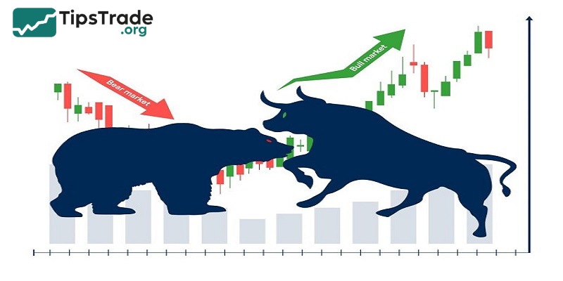
Chart patterns are shapes and recurring patterns on stock, commodity, or currency price charts, formed by price movements over time. Investors and technical analysts use these price patterns to predict the next market trend, whether prices will continue in the current direction (continuation) or reverse to the opposite direction (reversal).

>>See more:
- Basic price charts in trading and how to read each type
- Mastering candlestick patterns for effective trading
- Top 5 best technical indicators you shouldn’t miss
- Forex Pattern Trading: A Key to Predicting Currency Movements
Why is it important to analyze the chart patterns?
Chart patterns are charts that show the price movements of a financial asset (such as stocks, commodities, currencies) over time. Analyzing these chart patterns helps investors gain an overview of the market and make reasonable investment decisions.
Trend prediction: Chart patterns help investors identify up/down or sideways trends, thereby determining the possibility of a trend reversal early. Investors can decide to buy or sell based on these signs.
Identifying entry and exit points: The increase/decrease in price against the trend of a financial asset marks the point of buying or selling. By accurately determining the buying and selling points, investors can minimize the risk of loss and maximize profits.
- Entry point: When a chart pattern shows signs of reversal from bearish to bullish or when a trend continuation is confirmed.
- Exit point: When a chart pattern indicates a reversal from bullish to bearish or when the current trend is likely to end.
Risk reduction: Chart patterns help investors identify potential risks in the market, such as excessive price fluctuations or the formation of reversal patterns, thereby placing timely stop-loss or take-profit orders.
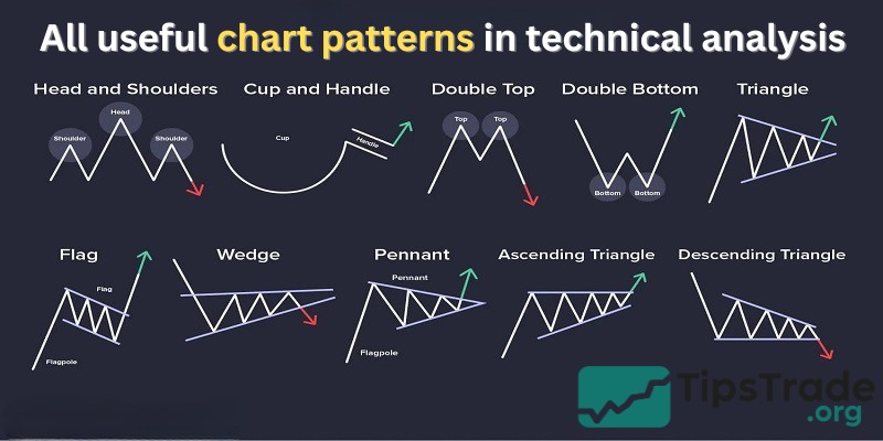
Popular types of chart patterns
Chart patterns can be basically classified into: Reversal and Continuation Patterns
- Reversal patterns indicate that an important reversal in the trend is taking place.
- Continuation patterns suggest only a pause in the current trend, after which the main trend will resume.
Reversal patterns
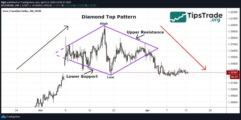
Diamond top
In terms of shape, the diamond top pattern is almost diamond-shaped, consisting of two support lines below combined with two resistance lines above. The intersection point above forms the peak level, and the intersection point below forms the bottom level.
After the price breaks below the lower right side of the diamond, the price will reverse and begin a downtrend. Therefore, the Diamond Top pattern is a reversal pattern that signals a potential end to an uptrend and a shift to a downtrend.
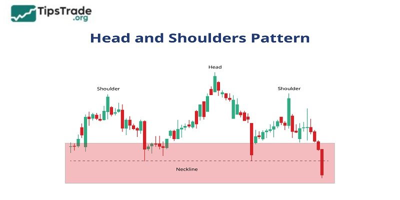
Head and shoulders
The Head and shoulders pattern consists of a low peak called the left shoulder, a high peak called the head, and another low peak called the right shoulder. There are two forms of this pattern:
- Head and shoulder: The two shoulders are above the neckline, indicating a price reversal from bullish to bearish.
- Inverted head and shoulders: The two shoulders are below the neckline, indicating a price reversal from bearish to bullish.
In which, the neckline is the line connecting the two lowest points of the two shoulders in the normal head and shoulders pattern, or the line connecting the two highest points of the two shoulders in the inverse head and shoulders pattern.
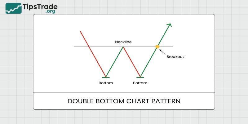
Double bottom
Shaped like a W, the Double Bottom pattern indicates that the price falls, touches the bottom twice in quick succession with a slight recovery in between, and then bounces back. This is a signal that selling pressure has weakened and the trend could shift to bullish.
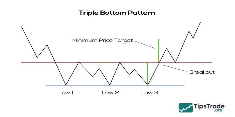
Triple bottom
Similar to the Double Bottom pattern, the Triple Bottom pattern forms when the price declines, touches the bottom three times at nearly the same level, creating a strong support zone. The uptrend began immediately after the price bounced from this support area and broke through the resistance line.
However, compared to the double bottom pattern, the triple bottom pattern shows a stronger reversal signal. The formation of another bottom indicates the consistency of the support area and increases the likelihood of a successful breakout.
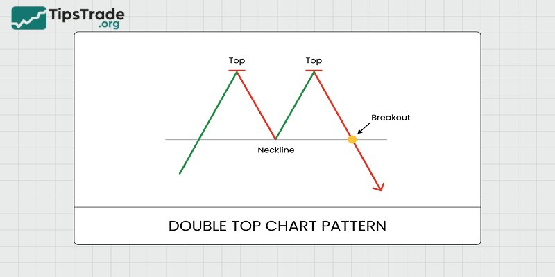
Double top
The double top pattern predicts a trend reversal from bullish to bearish.
As shown in the letter M, the price is in an uptrend and will drop after encountering strong resistance that it cannot break thru, forming the first peak at the top of the M. When it decreases, the price doesn’t break thru the support line, so it will turn back up, forming a bottom-top pattern under the letter M. Then, the price will repeat the phenomenon of turning back when it encounters resistance.
When the price breaks below the support line, the downtrend begins. This is the best selling point that investors should seize.
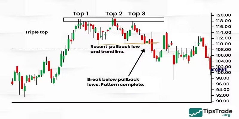
Triple top
The Triple Top pattern resembles three consecutive mountain peaks and typically forms within 3 to 6 months. The appearance of the third peak confirms that the uptrend has peaked and a new downtrend is about to begin.
Similar to the relationship between the double bottom and triple bottom patterns, the triple top pattern indicates a stronger downward trend in price.
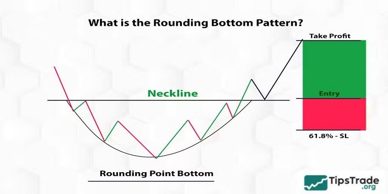
Rounding bottom
The Rounding Bottom pattern indicates a trend reversal from bearish to bullish. The shape of this pattern resembles an inverted U, indicating a gradual shift from selling pressure to buying pressure. When the price breaks above the neckline in an upward direction, it confirms the pattern and a new uptrend has begun.
Continuation patterns
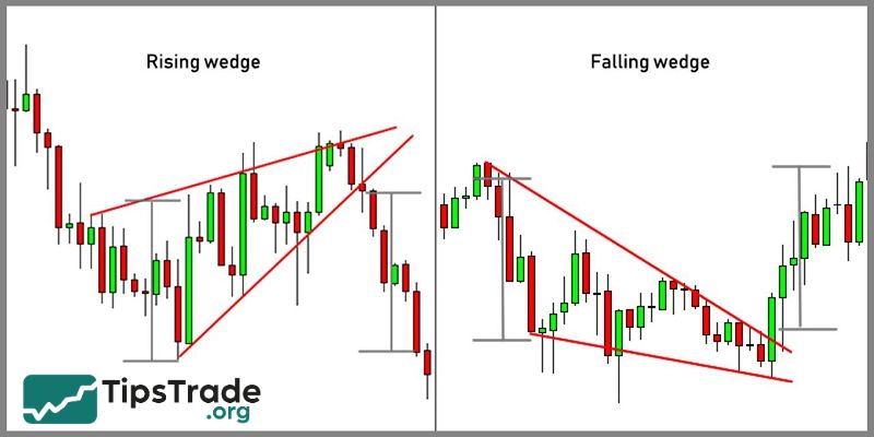
Wedge pattern
The wedge pattern is formed by two converging lines, which can signal the continuation of the current trend in the short term and will reverse in the future. The shape of this model is like a wedge, with the top narrowing toward the front.
The bullish wedge pattern and the bearish wedge pattern are the two main variations of the wedge pattern. Both patterns have similar structures; the bearish wedge pattern often signals a reversal from bearish to bullish, while the bullish wedge pattern usually signals a reversal from bullish to bearish.
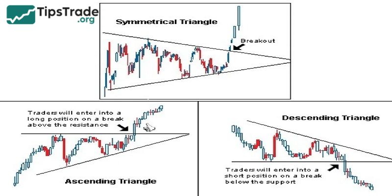
Triangle pattern
The triangle pattern is a price pattern characterized by the gradual convergence of support and resistance lines, forming a triangle-like shape. This pattern often appears after a strong trend and signals a pause in that trend because neither buyers nor sellers are decisive. This model has 3 forms:
- Ascending triangle: The support line is horizontal and the resistance line slopes upwards. The ascending triangle pattern often signals the continuation of an uptrend. After the price breaks the resistance line, the uptrend will be stronger.
- Descending triangle: The resistance line is horizontal and the support line slopes downwards. The descending triangle pattern often signals a continuation of the downtrend. After the price breaks the support line, the downtrend will be stronger.
- Symmetrical triangle: The support line slopes downwards and the resistance line slopes upwards, intersecting at one point. This pattern is less clear than the previous two types, as it can signal both a continuation or a reversal of the trend. When the price breaks out, investors need to consider other factors to make a decision.
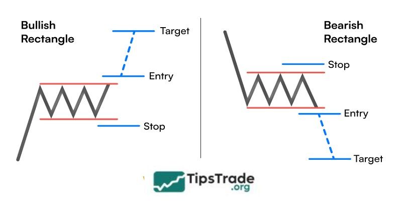
Rectangle pattern
The rectangle pattern forms when the price fluctuates between a horizontal support line and a horizontal resistance line, creating a rectangle shape. This pattern often signals a pause in the current trend. After the price breaks out of the rectangle, the previous trend will usually continue.
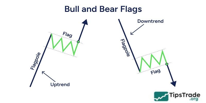
Flag
The flag pattern often appears after a period of strong price volatility. This pattern has enough flagpoles and flags, with the flagpole part being support and resistance lines, and the flag looking like a rectangle.
Unlike the rectangular pattern, the flag pattern has an additional short-term adjustment phase, creating a distinctive shape resembling a flying flag. There are 2 types of flag patterns:
- Bullish flag: The rising flag appears after a strong uptrend, is downward-sloping, and the price breaks above it to continue the uptrend.
- Bearish flag: The declining flag appears after a strong downtrend, is upward-sloping, and the price breaks down below to continue the downtrend.
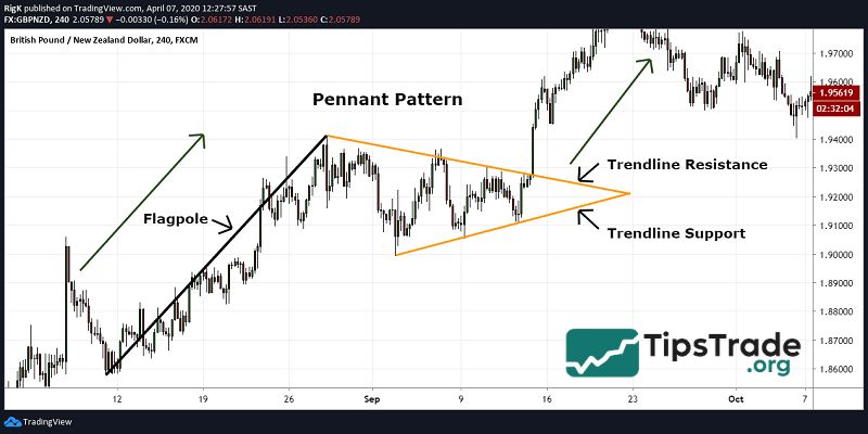
Pennant
After a period of strong price volatility, the market often goes thru a short-term accumulation phase, forming a pennant pattern. This is a sign that the forces driving the initial trend are still strong, and the trend will continue in the near future.
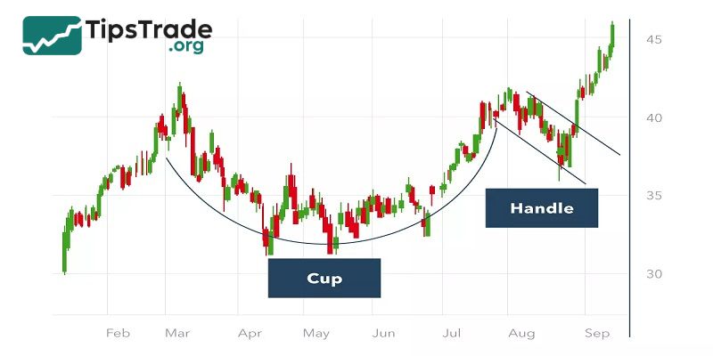
Cup and handle
With its distinctive shape consisting of a rounded cup and a small handle, the Cup and Handle pattern suggests that the market will continue to rise in an uptrend or reverse to an uptrend in a downtrend.
Benefits and limitations of chart patterns
Benefits of chart patterns
- High accuracy: The chart patterns have clear patterns that help investors accurately identify and predict price trends.
- Pre-signal: Using the chart patterns helps investors receive entry signals earlier, allowing them to better capitalize on investment opportunities.
- Visual shape: Chart patterns have a visual shape with different names, making them easy for technical analysts to remember and apply.

Limitations of chart patterns
- Depends on pattern completion: Only when the chart pattern is complete can investors predict price trends, which requires patience and waiting.
- Market volatility: Markets like stocks, forex, or crypto are often subject to unpredictable fluctuations, which can cause the chart pattern shape to sometimes be inconsistent, reducing the accuracy of predictions.
- Breaking the price and nested pattern: Some breakouts occur in chart patterns or nesting patterns within other patterns can confuse investors, affecting trading decisions.
Notes when performing technical analysis with chart patterns
To achieve the best results when using technical analysis with chart patterns, investors need to keep the following points in mind:
- Combined with other technical indicators: Technical indicators such as RSI, MACD, Bollinger Bands, etc., will provide confirmation signals or risk warnings, accurately identify entry points, and assess the strength of the trend when combined with price patterns.
- Choosing the right timeframe: Models formed over longer timeframes like medium or long-term will have higher accuracy than short-term models.
- Trading volume: High trading volume and the price breaking above the neckline indicate a strong and decisive market with the trend, and therefore the trend will be sustained, not a false effect.
- Patience: Identifying an accurate chart pattern requires patience and careful observation. Trading decisions should be based on technical analysis and adherence to a carefully calculated trading plan, not on emotions.
Conclusion
With chart patterns, traders can predict potential scenarios for the near future to develop trading plans. However, there must always be a plan when this pattern fails. Hopefully, this article will help investors better understand various price patterns for making better predictions. Good luck!