
Price charts are important tools that help traders and investors monitor price fluctuations in the financial market. In the article below, Tipstrade.org will introduce you to the most popular price charts in the market today, as well as provide detailed instructions on how to read each type of price chart. Let’s get started.
What are price charts?
Price charts are graphical representations of the historical movement of an asset’s price over a specific period. They display how the price of an instrument (such as: stocks, forex pairs, commodities, or cryptocurrencies,…) changes with time.
The structure of a price chart usually includes:
- X-axis (horizontal): represents the time period (minutes, hours, days, months, or years).
- Y-axis (vertical): shows the price of the asset.
- Depending on the type of chart, data points may include the opening price, closing price, high, low, and trading volume.
In essence, price charts serve as a roadmap for traders and investors to visualize past and current price actions.
Why price charts are important in trading
Price charts are the foundation of technical analysis. Instead of relying only on news or financial statements, traders can use price charts to study price behavior and market psychology. Key reasons they are essential include:
- Visualize market movements: Price charts make it easier to see whether an asset is trending upward, downward, or moving sideways.
- Identify trading opportunities: By analyzing price patterns, traders can pinpoint potential entry and exit points.
- Support technical indicators: Price charts work hand-in-hand with tools like moving averages, RSI, and MACD, giving more accurate signals.
- Risk management: By recognizing support and resistance levels, traders can set stop-loss and take-profit orders more effectively.
Types of price charts
There are many different types of price charts, each with its own advantages and suitable for different trading strategies. Below are the most common types of charts:
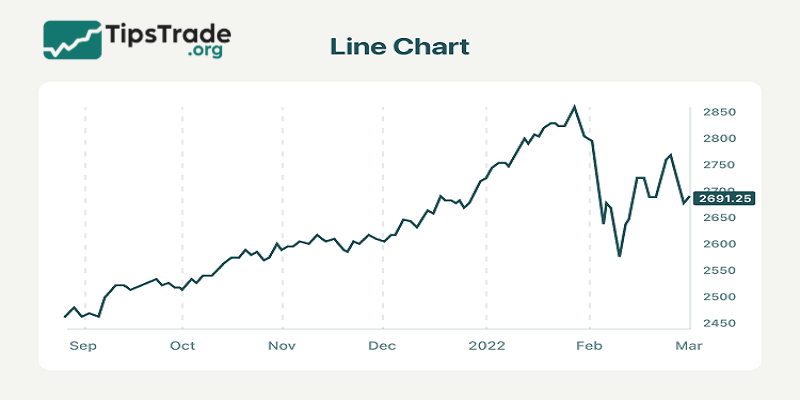
Line chart
A line chart is the simplest form to represent price fluctuations over time, drawn with a continuous line. This line is formed by connecting the closing price points of each trading session, creating a visual overview of the trend. The horizontal axis of the chart represents the time frame, which can be days, weeks, or months, while the vertical axis shows the corresponding price levels. Due to this simplicity, the line chart helps viewers easily identify the overall market trend.
How to use line charts:
To effectively read and understand line charts, traders need to focus on identifying trends by observing the direction of the line, thereby recognizing upward, downward, or sideways trends. At the same time, searching for reversal points, where the line changes direction suddenly, is also very important, as this may be a sign that a trend change is about to occur.
However, to have a more comprehensive view, it is essential to combine line charts with other technical indicators. Ultimately, assessing the direction of the line is also very important; if the line is going up, it indicates a growth in prices, while if the line is going down, it indicates a decline in prices.
Advantages:
- Simple and easy to read: The line chart is visual and easy to understand, suitable for beginners.
- Identifying long-term trends: It is very useful in observing and identifying the main trends of the market over a long period.
- Overall perspective: It helps traders gain an overview of the price movements of financial assets.
Disadvantages:
- Lack of detailed information: Line charts only show closing prices, overlooking other important information such as opening prices, highest and lowest prices during the session.
- Limitations in short-term analysis: Due to the lack of detailed information, line charts are not suitable for analyzing price fluctuations in the short term.
- Cannot fully represent market volatility within a trading day.
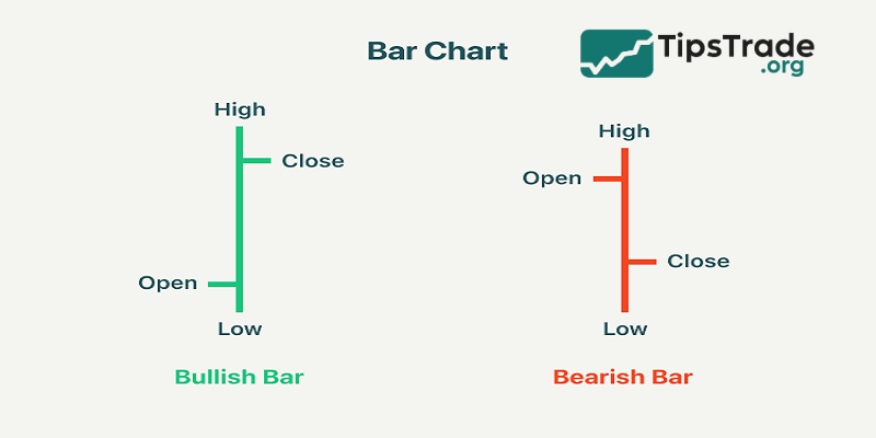
Bar chart
A bar chart is a popular technical analysis tool used to track and display the price fluctuations of a financial asset over a specific period of time. The characteristic feature of this chart is the use of vertical “bars” to represent the range of price movement during that time period.
Each vertical bar includes:
- Opening price: Marked by a small horizontal line on the left side of the bar.
- Closing price: Marked by a small horizontal line on the right side of the bar.
- Highest price: The top of the bar.
- Lowest price: The bottom of the bar.
The horizontal axis represents time, while the vertical axis represents price.
How to use bar charts:
When analyzing bar charts, the first thing to pay attention to is the position of the opening and closing prices. If the closing price is higher than the opening price, that bar indicates a price increase, usually represented in green or black; conversely, if the closing price is lower than the opening price, that bar indicates a price decrease and is usually drawn in red.
Next, determine the trading range by considering the length of the bars: the longer the bar, the greater the price volatility during the session. At the same time, analyzing the positions of the highest and lowest prices is also very important, as they reflect the buying and selling pressure in the market. Finally, to enhance the accuracy of the analysis, traders should combine bar charts with other technical indicators to confirm trading signals.
Advantages:
- Detailed information: Provides complete information about the opening price, closing price, highest and lowest prices during the trading session.
- Price fluctuation analysis: Helps traders analyze price fluctuations in a specific time period.
- Helps traders visualize the trading range within a session.
Disadvantages:
- Harder to read than line charts: Requires users to have experience and the ability to understand charts.
- More complex: Compared to line charts, bar charts are more complex.
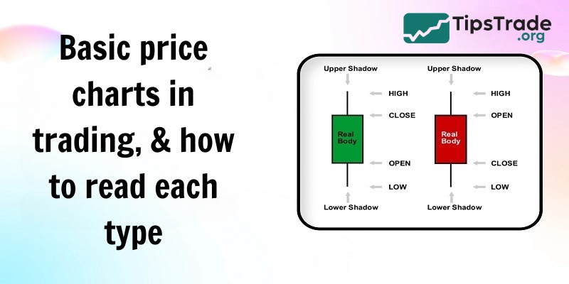
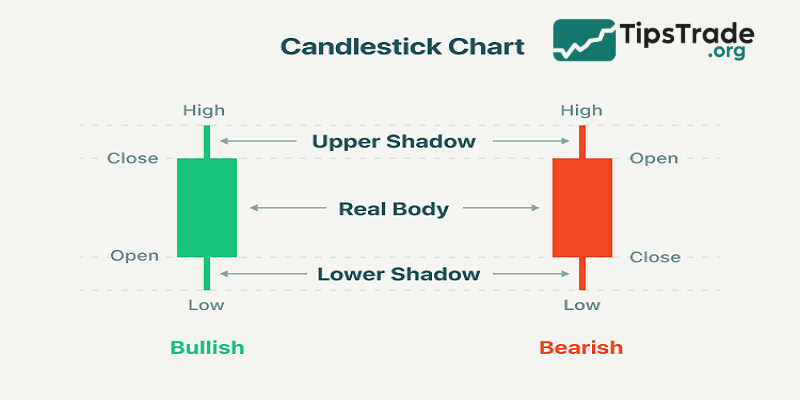
Candlestick chart
Japanese candlestick charts are a popular technical analysis tool used to describe the price fluctuations of financial assets over a certain period of time. Each “candle” represents a time frame, such as a trading day, and includes: the body of the candle (the range between the opening and closing prices, with color indicating an increase or decrease) and the wicks of the candle (the highest and lowest prices). The upper wick extends from the top of the body to the highest price, while the lower wick extends from the bottom of the body to the lowest price. The horizontal axis represents time, and the vertical axis represents price.
How to use Japanese candlestick charts:
To understand Japanese candlestick charts, traders need to perform some basic analysis steps. First, analyzing the body of the candlestick helps determine whether the price trend is rising or falling based on its color and size. Next, observing the wicks of the candlestick helps assess the buying and selling pressure in the market, based on their length. Another important step is to identify common candlestick patterns such as Doji, hammer, engulfing, etc., to predict trend reversals or continuations.
Finally, to increase accuracy, combining candlestick charts with other technical indicators is necessary, helping to confirm signals and make effective trading decisions.
Advantages:
- Visual information: Provides a clear and easy-to-understand view of price fluctuations, helping investors quickly grasp the market situation.
- Pattern recognition: Allows for easy identification of candlestick patterns, thereby predicting the next price trend.
- Fully represents all price levels in a trading session.
Disadvantages:
- Knowledge requirement: Users need to have knowledge of candlestick patterns and how to interpret them.
- There are many types of patterns, so it takes time for users to become familiar.
Other price chart types
In addition to the three basic types above, there are some specific charts:
- Point & Figure Chart: focuses on price movements while ignoring the time factor. Suitable for identifying long-term trends.
- Renko Chart: uses “bricks” to represent price movements. Filters out noise, helping traders focus on the main trend.
- Heikin Ashi Chart: is a variant of the candlestick chart, using an average formula to smooth the data, making it easier to see trends.
Tips for using price charts in trading
Clearly define your trading goals
For short-term trading, such as day trading or swing trading, it is extremely important to track the details of price movements during the session. Therefore, Japanese candlestick charts or bar charts are preferred. In particular, focusing on short time frames, such as 1 minute, 5 minutes or 1 hour, allows traders to promptly grasp short-term trading opportunities.
In contrast, in long-term trading, such as value investing or trend investing, looking at the overall market trend is key. However, to confirm signals more accurately, long-term investors often use a combination of line charts and Japanese candlestick charts. At the same time, focusing on longer time frames, such as days, weeks or months, helps investors make decisions based on the overall market picture.
Choose the chart that suits your experience
For beginners, line charts are ideal because of their simplicity and ease of understanding, helping them get acquainted with how the market works. Once they have mastered the basics, they can gradually move on to Japanese candlestick charts to enhance their analytical skills, thanks to the amount of detailed information that this type of chart provides.
Experienced traders often prefer Japanese candlestick charts because of their ability to provide valuable and visual information about the market. They also flexibly combine different types of charts and technical indicators to have a comprehensive view, thereby making more accurate trading decisions.

Final words
In summary, price charts are at the heart of trading, providing traders with a visual insight into price action and market sentiment. Whether you are a beginner or a professional trader, mastering the different types of price charts and knowing how to combine them with other analytical tools will help optimize your investment strategy. To trade successfully, regularly practice reading price charts and apply them flexibly in various market conditions. Don’t forget to follow Tipstrade.org for the latest useful trading knowledge updates!