
Candlestick chart is a popular term, providing a lot of useful information in stock investment. However, not everyone knows the nature of candlestick charts and how to read candlestick charts. In the article below, Tipstrade.org will help you learn about this term, helping you better understand the models and roles of candlestick charts in stock investment.
What is a candlestick chart?
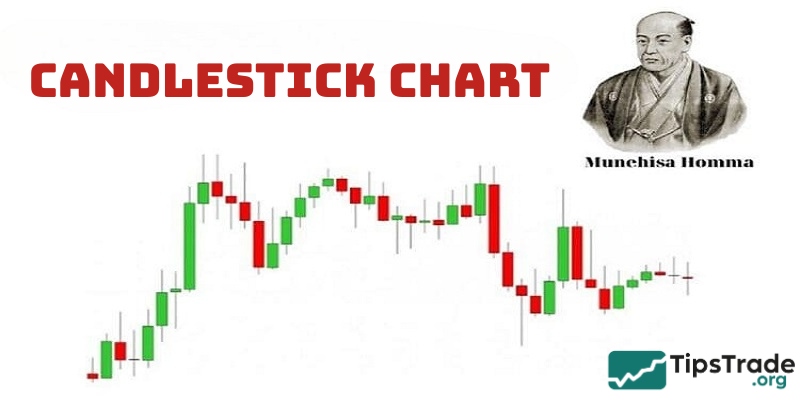
Candlestick chart, also known as Japanese candlestick chart, is a type of financial chart used to describe the price movement of securities based on past price patterns.
Candlestick patterns were invented by Munehisa Homma, a Japanese merchant, in the 18th century. Their original purpose was to record the price movements of rice.
Steve Nison is credited with researching the principles of candlestick patterns and popularizing this method through his book, “Japanese Candlestick Charting Techniques”.
>>See more:
- What is Bar Chart in Stock Market & How to Read
- How to Read a Line Chart in Technical Stock Analysis
- What is a Candlestick Chart and How to Read it?
- Continuation Patterns in Trading Key Insights for Traders
The role of candlestick charts in stock investment
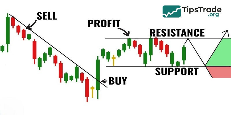
Each candlestick chart tells a “story” about the battle between bull and bear markets, between buyers and sellers, between supply and demand, and between fear and greed.
Therefore, investors often use candlestick patterns to monitor market developments and determine reasonable entry points.
It is important to note that most candlestick patterns require confirmation based on the context of the previous and subsequent candles. Traders need to combine reading Japanese candlesticks with analyzing other patterns and indicators to achieve the best results.
How to read a candlestick chart
Types of candles
Candlestick charts are typically divided into two main categories:
- Bullish candle (green or white): Shows that the price has increased during the period considered. The opening price is lower than the closing price.
- Bearish candle (red or black): Shows that prices have fallen over the period considered. The opening price is higher than the closing price.
Time frames
Each candle represents a specific period of time. For example:
- 1 minute candle: Represents price movements within one minute.
- 1 hour Candle: Represents price movements within one hour.
- 1 day Candle: Represents price movements over the course of one day.
Depending on your trading style, investors can choose the timeframe that best suits them. For example, day traders often use 1-minute or 5-minute charts. Meanwhile, swing traders may prefer daily or weekly charts.
Anatomy of a candlestick
A candle encapsulates four points of data:
- Open – representing the first trade executed during the specified period.
- High – indicating the highest traded price observed during the period.
- Low – denoting the lowest traded price recorded within the period.
- Close – signifying the last trade executed during the specified period.
These four data points are often abbreviated as OHLC (Open, High, Low, Close).

Candlestick body
The real body of the candlestick represents the difference between the opening and closing prices during a specific time period. A long body indicates strong buying or selling pressure, while a short body reflects more indecision or minimal price movement.
Wicks or shadows
The wicks, also known as shadows, extend from the top and bottom of the body and show the highest and lowest prices reached during the period. The length of the wicks is usually significant to the candlestick analysis.
- Upper wick: Shows the highest price.
- Lower wick: Shows the lowest price.
Popular candlestick patterns to know
Candlestick patterns help stock investors identify potential market trends and reversals. Below are some key patterns to know:
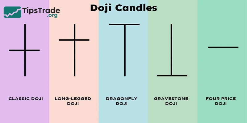
Doji candlestick pattern
Doji is a candlestick pattern that appears when the closing price is almost equal to the opening price. The characteristics of Doji candles are short candle bodies or no candle bodies, candle shadows can be long or short. If it will have a cross shape.
The Doji candlestick pattern represents a struggle between buyers and sellers and neither side is profitable.
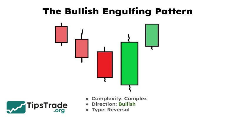
Engulfing candlestick patterns
Engulfing candlestick patterns usually include two types: Bullish Engulfing and Bearish Engulfing.
- The structure of the Bullish Engulfing pattern consists of 2 candles, in which the bearish candle appears first, the bullish candle appears later and long engulfs the previous bearish candle. The engulfing of the green candle shows a strong bullish reversal signal.
- Meanwhile, the Bearish Engulfing pattern also consists of 2 candles, but in which the bullish candle appears first, followed by a long bearish candle that engulfs the previous bullish candle, marking a reversal to the downtrend and showing the overwhelming tendency of the sellers.
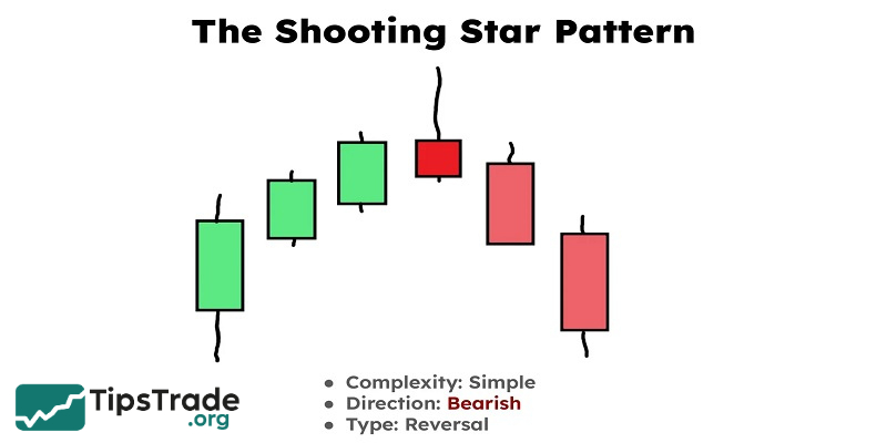
Shooting star candlestick pattern
The Shooting star candlestick pattern has a small body, the upper shadow is 2-3 times longer than the body while the lower shadow is almost non-existent. This is one of the most typical strong reversal candlestick patterns. When the Shooting star candlestick pattern appears, it is a signal that the buyers are dominating and pushing the price up, causing the upper shadow to be long. However, because the sellers are stronger, at the end of the session, the price is pulled back to near the opening level.
Normally, the shooting star candlestick pattern appears at the top of an uptrend.
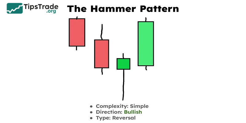
Hammer candlestick pattern
A hammer is a bullish reversal pattern that forms after a downtrend. It has:
- A small body.
- A long lower wick.
- Little to no upper wick.
This pattern indicates that buyers pushed the price higher after significant selling pressure.
Practical tips for reading candlestick charts
- Use in context: Always consider candlestick patterns in the context of the overall trend and support/resistance levels.
- Combined with indicators: Tools like Moving Averages, RSI and MACD can help enhance the quality of your analysis.
- Start with the big timeframes: If you are new, start with a daily chart to get a clearer view of market trends.
- Practice on the trading platform: Platforms like TradingView allow you to explore charts and practice your analytical skills.
Comparing candlestick charts to other chart types
Candlestick charts offer superior visualization and pattern recognition, making them ideal for active traders. While bar charts provide similar data, they lack the clear visual cues that candlestick charts provide. Line charts, while useful for identifying trends, do not show the detail of price movements.
Below is a detailed comparison table:
| Feature | Candlestick Charts | Bar Charts | Line Charts |
| Price Points | Open, High, Low, Close | Open, High, Low, Close | Close Only |
| Visual Clarity | High | Moderate | Low |
| Pattern Recognition | Strong | Strong | Weak |
Limitations of candlestick charts you should consider
Despite its wide application, candlestick charts still have certain limitations that require you to be very careful when applying them. Some common limitations of candlestick chart are:
- Market trend development is not displayed: The stock market is very diverse, so if you only read one candlestick chart, it will be difficult to grasp the market trends. Therefore, investors should read a combination of different candlestick patterns with appropriate indicators to filter and find accurate and useful information for themselves.
- The smaller the time frame, the more noisy the information provided: Although candlestick charts provide a lot of necessary information for investors, the smaller and narrower the candlestick frames, the more likely it is that the information provided will be misleading and fake. Therefore, you need to consider multiple time frames and combine other analytical indicators to limit risks during the trading process.
Conclusion
The above is basic information related to candlestick charts, their role, and how to read them. Tipstrade.org hopes that this useful information will help you better understand candlestick charts, allowing you to fully utilize the features this tool offers in investing and help you achieve the greatest returns!
See more: