
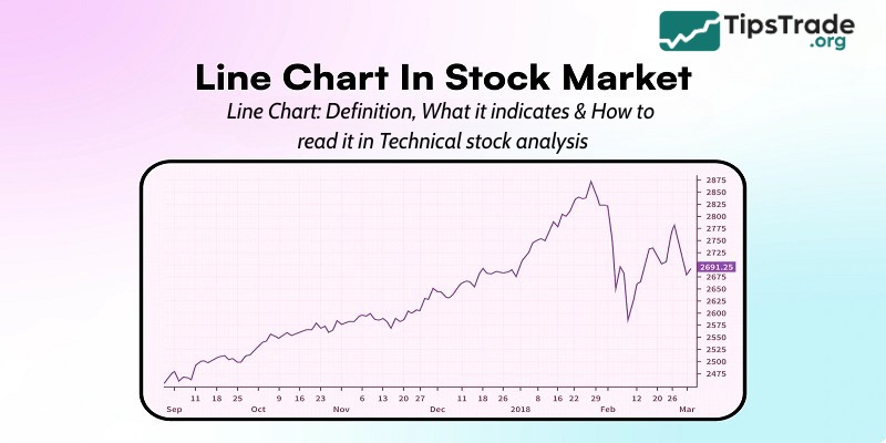
In stock investing, there are many different types of charts that help you visualize price patterns. And a line chart is one such chart. Let’s read the following article from Tipstrade.org about how to read a line chart in technical stock analysis!
What is line chart in stock market?
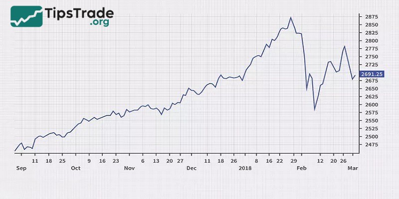
A line chart is a visual representation in which data points are connected by straight lines. It is a simple and suitable tool for observing trends, patterns or changes that occur over time. In the field of stock markets, line charts are often used to show the historical prices of stocks, indices or financial instruments. The points on a line graph represent the asset’s data at a specific point in time, while the lines connecting them show the fluctuations of the data over time.
The main components of a line graph include:
- X-axis: Represents the independent variable, usually time.
- Y-axis: Represents the dependent variable or value being measured.
- Data points: Are individual points plotted on a graph that represent a specific value of a data series.
- Line segments: Are straight lines connecting all data points in each data series.
- Legends: Labels used to distinguish different data series on the chart.
- Title: Is a label that describes the topic of the chart.
- Axes labels: Represent the units or context of the data presented on the line graph.
>>See more:
- How to Read Stock Charts Like a Professional
- What is Bar Chart in Stock Market & How to Read
- What is a Candlestick Chart and How to Read it?
- Continuation Patterns in Trading Key Insights for Traders
What does a line chart indicate?
When an investor uses a line graph in the stock market, they can easily see whether a stock is rising or falling in price. Rising stocks will be represented by an upward sloping line, while declining stocks will appear as a downward sloping line. This data is very important in making business decisions.
In addition, line charts in the stock market help investors understand how to read and analyze stock price trends. When a trading method uses this type of chart, it is called a line chart trading method.
The biggest advantage of line graphs in the stock market is their simplicity and ease of use, suitable for all types of investors, including beginners.
Types of line charts
Line charts come in various forms, each serving a unique purpose. Let’s explore the different types of line graphs.
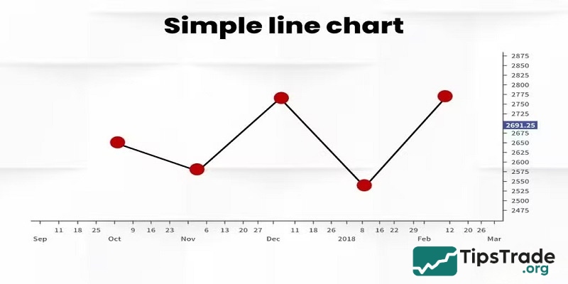
Simple line chart
A simple line chart is the most basic form, showing just a single series of data plotted on a chart. It consists of a single line connecting consecutive data points, usually the closing price of a stock or index over a given period of time. The vertical (Y) axis represents price or value, while the horizontal (X) axis represents time.
This chart provides a clear and easy-to-understand visual representation of the performance of a single asset or data over time. Its main purpose is to help viewers quickly identify the overall trend (up, down, or sideways), identify major peaks and troughs, and assess the overall volatility of that asset.
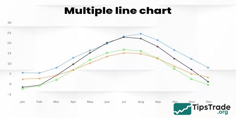
Multiple line chart
Multiple line charts show two or more data series on the same coordinate system. Each data series is represented by a separate line, distinguished by a different color or line style (e.g., solid, dashed). All these lines share a common horizontal (time) and vertical (value) axis.
The main purpose of multiple line charts is comparison. It allows traders and analysts to directly compare the performance, trends, and volatility of stocks, indices, sectors, or other data sets over the same time period.
Compound line chart
The term “compound line chart” is less common than “simple line chart” or “multiple linechart” and is often used to refer to advanced or customized forms of charts, rather than a basic chart type. In financial analysis, it typically describes a chart that presents aggregated or synthesized information from multiple underlying data series, often displayed as a single line or a composite line.
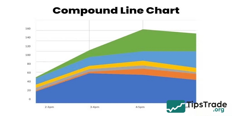
Instead of just comparing individual lines (as in a polyline chart), a composite chart can include the following methods:
- Aggregation: Creates a custom index or a single line that represents the aggregate performance of a group of stocks, such as in a portfolio or a specific industry.
- Contribution analysis (Stacked line charts): Although sometimes considered a separate type of chart, a stacked line chart can also be considered a type of summary chart. Here, lines representing different components are plotted on top of each other, showing the trends of each part as well as the overall whole. This display helps illustrate how each part contributes to the whole over time.
How do I read the stock market line chart?
A line graph shows the market price of a stock over a period of time on the stock market. The X-axis of the chart represents time, while the Y-axis represents the stock price. Each point plotted on the chart represents the stock price at a particular point in time, and the line connecting the points shows the movement of the stock price over time. This period can be measured in days, weeks, months, or years.
The overall direction of the chart movement indicates the stock price trend during technical analysis.
- The up line indicates that the price is rising.
- The downtrend line indicates that the price is falling.
- The horizontal line indicates a stable price.
Pros and cons of using stock line chart
Pros:
- Line graphs filter out all of the market noise.
- Their simplicity makes the market appealing and easy to follow.
- The simplicity of the line graph also helps traders determine the support and resistance level, turning points, and various chart patterns.
Cons:
- Line charts filter out too much market noise and do not provide enough price information.
- Line graphs miss out on crucial data that would otherwise impact trading decisions.
- Line graphs can generate a lot of false signals if used incorrectly.
Difference between line chart and bar chart
Let’s understand the difference between a line graph and a bar chart below:
|
Feature |
Line Chart in Stock Market |
Bar Chart in Stock Market |
|
Definition |
A line chart in the stock market is a simple graph that connects closing prices over time. |
A bar chart shows four price points: open, high, low, and close for each time period. |
|
Appearance |
A stock market line graph has a single line moving up or down based on closing prices. |
A bar chart has vertical bars with horizontal lines showing open and closed prices. |
|
Data Representation |
The line graph in trading only shows closing prices. |
The bar chart displays more details: open, high, low, and close prices. |
|
Accuracy |
The line graph in the stock market is accurate for showing general trends. |
Bar charts provide a more detailed price action analysis. |
|
Focus |
Focuses on where prices ended each period and the general flow. |
Focuses on the entire price range and the relationship between the four key prices (OHLC). |
|
How It Looks |
A single, connected line moving across time. |
Vertical bars for each period, showing the high-low range, with small marks for open and close prices. |
Final thoughts
With the information above, Tipstrade.org hopes that investors have been able to learn more about how to read a line chart in technical stock analysis. Don’t forget to follow Tipstrade.org for the latest stock market information and knowledge updates!
See more: